Kubo: Building a Seamless Digital-First Pod Experience
Context
Kubo is a luxury pod hotel chain launching in Seattle, designed for modern travelers who value innovation, sustainability, and efficiency without sacrificing premium experience.
The hospitality industry is shifting toward space-efficient accommodations with integrated technology and eco-conscious design. These travelers expect seamless digital experiences, accessible luxury, and personalized control throughout their stay.
Kubo's unique challenge: deliver all of this with minimal on-site staff—just one support person for exceptional situations. Everything from booking to check-in, room controls to concierge services would happen through their app.
The Challenge
Traditional hotels rely on front desk staff to guide guests, resolve issues, and create a sense of care. Kubo needed to replicate that hospitality entirely through technology—without making guests feel abandoned or frustrated.
The experience had to be flawless from the first interaction. Any friction in booking, check-in, or room access could escalate quickly when no staff were available to intervene.
Beyond operational functionality, Kubo wanted genuinely innovative features—voice AI, 3D pod previews, biometric check-in, gamification—that felt purposeful and cohesive, not like a disconnected tech showcase.
The design mandate: create an app that makes technology-driven hospitality feel not just functional, but genuinely premium.
My Role and Team
I led the project as Design Lead, responsible for the overall experience and delivery of the app—from user flows to visual design and interaction patterns.
I worked with a two-person design team in a freelance capacity, collaborating directly with Kubo's stakeholders throughout the two-month timeline.
Since this was a freelance engagement, I established clear collaboration structures from the start: scheduled touchpoints, Figma-based feedback loops, and transparent delivery timelines to keep everyone aligned across different schedules.
Approach
We began by establishing visual direction through industry benchmarking and moodboarding. I guided the team in creating three brand interpretations, which we narrowed down collaboratively with the client to find the right balance of sophistication and approachability.
Before designing screens, we mapped user flows and documented features in detail, ensuring shared understanding of scope and priorities. This helped us identify the critical path: what guests absolutely need versus what enhances their experience.
We designed iteratively in Figma, building interactive prototypes that let stakeholders experience the app as it evolved. This was especially valuable for complex features like voice AI and 3D walkthroughs, where static screens couldn't capture the intended experience.
Throughout the process, I balanced craft with speed—maintaining design quality while staying nimble enough to adapt as constraints shifted.
Design Craft
The design centered on three principles: effortless self-service, contextual intelligence, and premium delight.
Effortless Self-Service
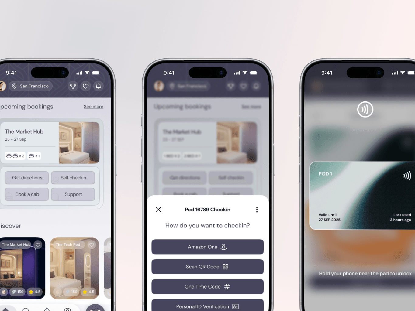
We created a seamless booking flow with map-based browsing, allowing guests to see available pods across locations and book in seconds. Check-in was completely contactless—guests could scan a QR code to unlock their pod or use Amazon One biometric authentication for instant access. Smart pod controls through a 2D map interface let guests manage lighting, temperature, and entertainment without any learning curve.
Contextual Intelligence Through Voice AI
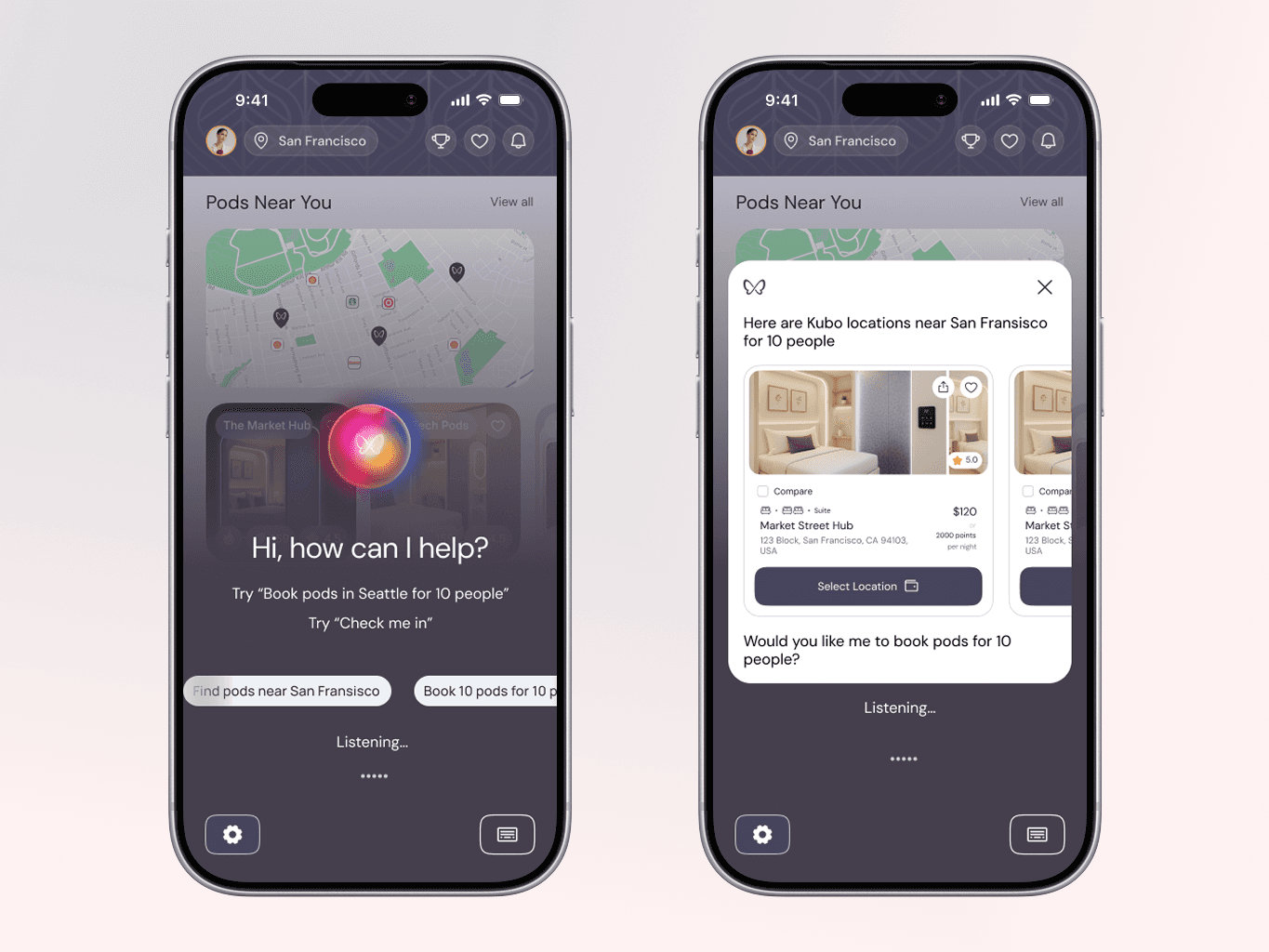
Rather than treating voice as a novelty, we designed it as the primary interface for high-context tasks: booking pods, arranging valet or ride services, ordering amenities, and discovering nearby attractions. The challenge was making it feel magical when it worked and graceful when it didn't, with careful attention to conversational flows and fallback states.
Premium Delight
The 3D pod walkthrough let guests explore their space before arrival—rotating, zooming, and understanding layout and amenities. This turned booking from a transaction into an experience that built confidence and excitement.
We designed a gamification and loyalty system that rewarded guests with experience badges and points for milestones like repeat stays or trying new amenities. These unlocked real benefits: priority booking, room upgrades, and access to exclusive NFT collectibles in Kubo's digital marketplace—features that felt purposeful for tech-forward travelers, not gimmicky.
Impact
The Kubo app is currently under development and slated to launch alongside their first Seattle property in early 2026.
The client response to the final designs was extremely positive—they felt the app successfully balanced the operational efficiency they needed with the premium brand experience they wanted to project.
By grounding every decision in real guest needs and operational constraints, we created an experience where ambitious features like voice AI, 3D walkthroughs, and biometric check-in felt cohesive and purposeful rather than disconnected.
Reflection
This project reinforced that the best digital hospitality experiences use technology to amplify care and remove friction, not replace human warmth with cold efficiency.
If I could revisit the project, I would advocate for user testing earlier—particularly around voice AI flows and the check-in experience. While we designed based on best practices and stakeholder input, observing real travelers in context would have surfaced valuable nuances.
Kubo demonstrates that technology isn't a barrier to premium experience—when designed thoughtfully, it's the enabler of it.